In Academic IELTS Writing Task 1, you are given a visual — a chart, graph, table, process diagram, or map — and asked to describe the key features in at least 150 words in approximately 20 minutes. You are not asked for opinions or to explain why something happened. You simply describe what the data shows. Task 1 is worth one-third of your Writing band score.
Task Achievement
Did you address the task fully? Have you written 150+ words, included an overview, and selected the most significant features? Missing the overview caps you at Band 6 for this criterion.
Coherence & Cohesion
Is your response logically organised? Does it flow well? Examiners look for clear paragraph structure, appropriate linking words (however, in contrast, similarly), and a logical sequence of ideas.
Lexical Resource
Do you use a variety of vocabulary accurately? Avoid repeating the same words ("increased", "showed"). Use synonyms, collocations, and precise language. Paraphrasing the prompt well is also assessed here.
Grammatical Range & Accuracy
Do you use a mix of sentence structures correctly? Simple sentences alone limit you to Band 5–6. To reach Band 7+, use complex sentences with relative clauses, passive voice, and varied tense forms.
Introduction
Paraphrase the prompt. Say what the visual shows and the time period or location if given.
Overview
2–3 sentences on the most striking trends or differences. No specific data — just the big picture.
Body Paragraph 1
Describe the first key group of data with specific figures. Make comparisons.
Body Paragraph 2
Describe the second key group of data. Highlight anything notable or surprising.
Paraphrase the prompt — do not copy it
Change the vocabulary and structure of the task question. If the prompt says "The chart shows the percentage of people who…", write "The bar chart illustrates the proportion of individuals who…". Never copy the prompt word for word — examiners subtract this from your word count.
Summarise the 2–3 most important things the data shows
No specific numbers here. Identify the biggest trend, the most notable comparison, or the most striking feature. Use phrases like: Overall, it is clear that… / In general, the most noticeable trend is… / It is evident that…
Describe the first group of data with specific figures
Group related data together logically — for example, the two highest categories, or one time period. Always include specific numbers from the chart. Use comparative language: higher than, almost double, significantly more than, by contrast.
Describe the second group — include anything surprising
Cover the remaining data. If there is anything unexpected or notable — an exception to a trend, a particularly high or low value — highlight it here. End with a sentence that draws the key comparison between Body 1 and Body 2.
Write at least 150 words
Examiners count. Going under the limit automatically lowers your Task Achievement score — there is no way around this. 160–190 words is the ideal range.
Never give opinions or explain causes
Do not write "This may be because…" or "In my opinion…". You are describing what the data shows, not analysing why. Opinions are penalised in Task 1.
Always include specific data
Vague statements like "the numbers went up" score badly. Always support your descriptions with specific figures: "rose sharply from 20% to 45%", "the highest figure was 78,000".
Spend no more than 20 minutes
Task 2 is worth twice as many marks. Most students spend too long on Task 1 and rush Task 2. Practise stopping at 20 minutes regardless of whether you feel finished.
Select — don't describe everything
You cannot and should not describe every single data point. Choose the most significant features and group similar data together. The examiner wants to see that you can identify what matters.
Vary your language throughout
Using "increased" for every rise will hurt your Lexical Resource score. Vary between: rose, grew, climbed, surged, jumped, shot up — and fell, dropped, declined, decreased, plummeted, dipped.
Use linking words between data points
Connect your data smoothly: Similarly, by contrast, while, whereas, on the other hand, in comparison, meanwhile. Without these, your writing will feel like a list of numbers rather than an analysis.
Paraphrase the introduction — never copy
The introductory sentence should paraphrase the task question using different vocabulary. Copied text is not counted in your word total and signals poor lexical resource to the examiner.
Strategy
- Identify the highest and lowest bars immediately — these form your overview
- Group bars by category or time period in your body paragraphs
- For grouped bar charts, compare the two sets of bars directly
- Always specify the exact percentages or figures when making comparisons
- Note whether bars show absolute numbers or percentages — use the right language
Common mistakes
- Describing every single bar rather than grouping and comparing
- Forgetting to include specific figures to support descriptions
- Using the same verb ("increased") for every bar
Key language
Strategy
- Overview: identify the largest and smallest segments immediately
- Group segments — largest to smallest, or by category (e.g. renewable vs non-renewable)
- If two pie charts are shown (comparing two time periods), compare each segment across both
- Always use percentage language — "accounted for", "made up", "comprised", "represented"
- Note if any segments are roughly equal in size — this is worth mentioning
Common mistakes
- Simply listing all the percentages without making comparisons
- Forgetting to group data — just going clockwise around the chart
- Not summing related categories ("together, X and Y accounted for 55%")
Key language
Strategy
- Identify overall trends first — rising, falling, fluctuating, stable
- Note the starting and ending points for each line
- Identify any peaks, troughs, or points where lines cross
- For multiple lines, group in body paragraphs by trend similarity
- Use specific years and figures at key turning points
Common mistakes
- Describing every small fluctuation rather than the overall trend
- Forgetting to mention where lines start and end
- Ignoring crossover points where two lines meet
Key language — trends
Strategy
- Scan the whole table first — find the overall highest and lowest values
- Look for cross-column patterns — not just within columns
- Group rows by similarity in body paragraphs
- Highlight any unexpected relationships (e.g. long hours but low pay)
- Do not describe every cell — select the most significant data
Common mistakes
- Simply reading across each row without making comparisons
- Ignoring notable relationships between columns
- Using the same comparative structure for every comparison
Key language
Strategy
- Count the stages before writing — mention the total in your introduction
- Use passive voice throughout: "the water is filtered", "sludge is removed"
- Cover every stage — unlike charts, all stages must be described
- Mention any by-products or loops in the cycle
- Use sequencing language to link each stage clearly
Common mistakes
- Using active voice ("workers filter the water") instead of passive
- Skipping stages — every step must be included
- Forgetting to mention by-products or end uses
Key sequencing language
Strategy
- Organise by zone — describe changes in the north, then south, for example
- Use change verbs: replaced by, converted into, demolished, extended, retained, constructed
- Note what stayed the same as well as what changed
- For two maps, compare each area between the two time periods
- Mention location of each change precisely — do not just say "a building was added"
Common mistakes
- Randomly listing changes without logical grouping by location
- Forgetting to mention things that did not change
- Vague location language ("somewhere in the middle")
Key location & change language
Music Concert Attendance by Age Group
The chart below shows the percentage of people in different age groups who visited music concerts between 2010 and 2015. Summarise the information by selecting and reporting the main features, and make comparisons where relevant.
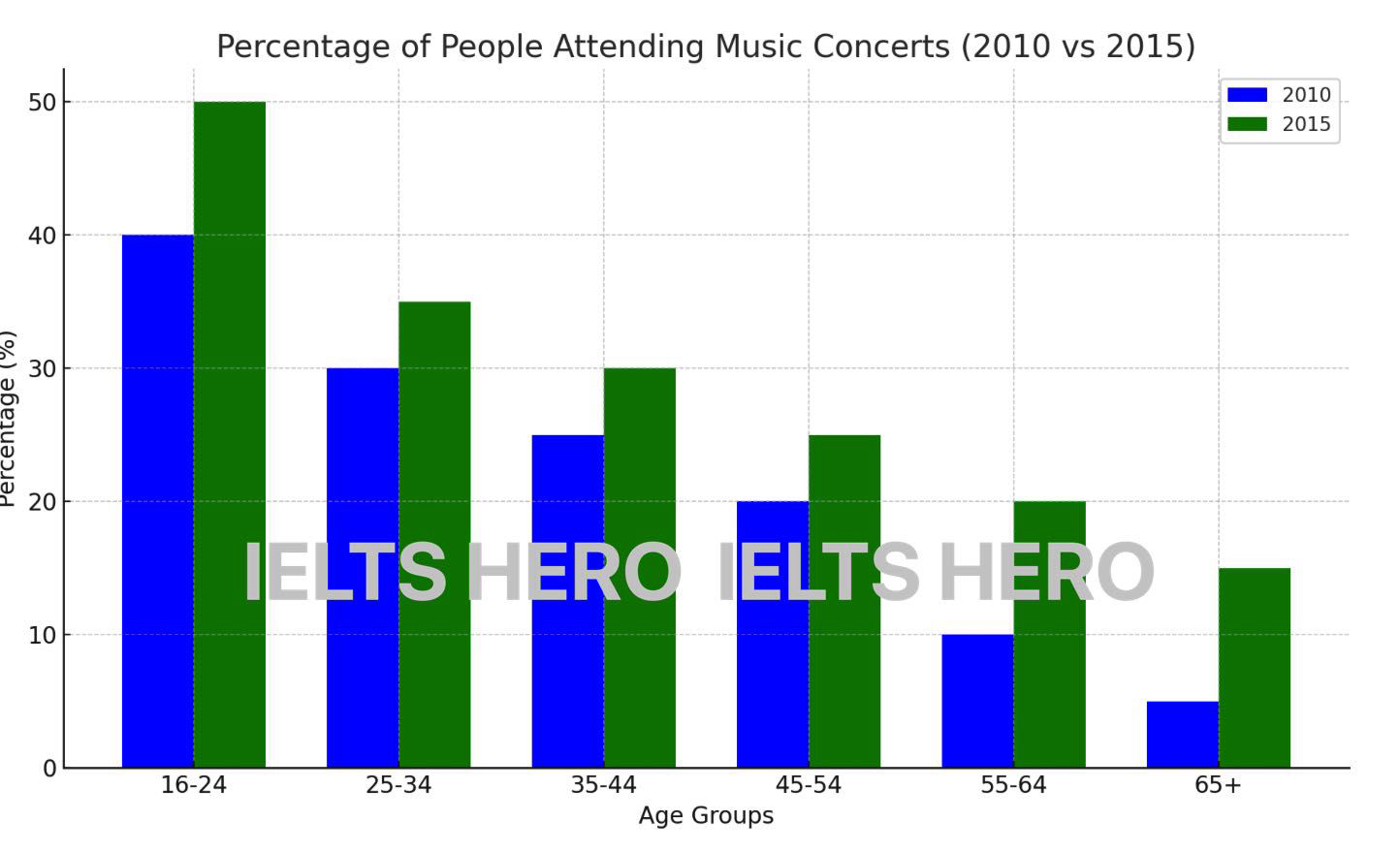
The bar chart illustrates the proportion of individuals across six age groups who attended music concerts in 2010 and in 2015.
Overall, concert attendance rose across every age group over the five-year period. Younger age groups consistently recorded the highest attendance in both years, while the most striking proportional increases were seen among the two oldest groups.
In both years, the 16–24 age group had the highest attendance, rising from 40% in 2010 to 50% in 2015. The 25–34 group followed a similar upward trend, increasing from 30% to 35%. Attendance in the 35–44 and 45–54 groups also grew moderately — from 25% to 30% and from 20% to 25% respectively — meaning all four younger cohorts saw a rise of 5–10 percentage points.
By contrast, the two oldest groups experienced far more dramatic relative gains. Attendance among 55–64 year-olds doubled from 10% to 20%, while the 65+ group saw an even more notable rise, tripling from just 5% to 15%. Despite these significant increases, older age groups still attended far less frequently than younger people, with the 65+ figure in 2015 (15%) remaining lower than the 35–44 figure in 2010 (25%).
Energy Sources for Electricity Generation
Pie ChartThe pie chart below shows the distribution of energy sources used to generate electricity in a country in 2022. Summarise the information by selecting and reporting the main features and make comparisons where relevant.
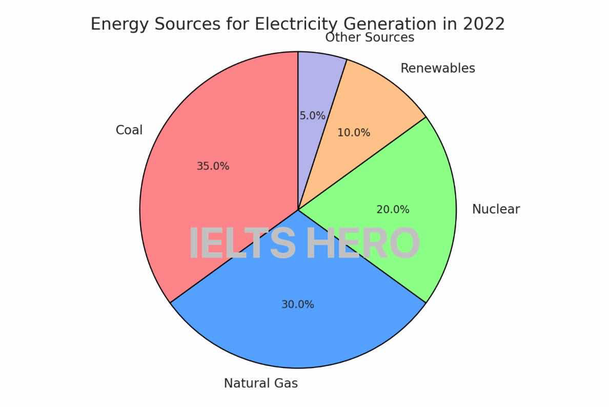
The pie chart illustrates the proportion of different energy sources used to generate electricity in a country in 2022.
Overall, coal was the most significant contributor to electricity generation, accounting for 35% of the total energy supply. This was closely followed by natural gas, which made up 30% of the energy mix. Together, these two non-renewable sources represented a substantial 65% of the country's electricity production.
Nuclear energy was the third-largest contributor, providing 20% of the total. While it is not a fossil fuel, it still plays a critical role in the country's energy strategy. Renewable sources, including solar, wind, and hydroelectric power, contributed 10% of the total energy output. Despite growing global awareness of renewable energy, this percentage remains relatively small compared to non-renewable sources.
Finally, other energy sources not specified in the chart made up just 5% of the electricity generation, indicating that less conventional sources had a minor impact on overall production.
International Students in Three Countries
Line GraphThe line graph below shows the number of international students in three different countries (Country A, Country B, and Country C) between 2010 and 2020. Summarise the information by selecting and reporting the main features, and make comparisons where relevant.
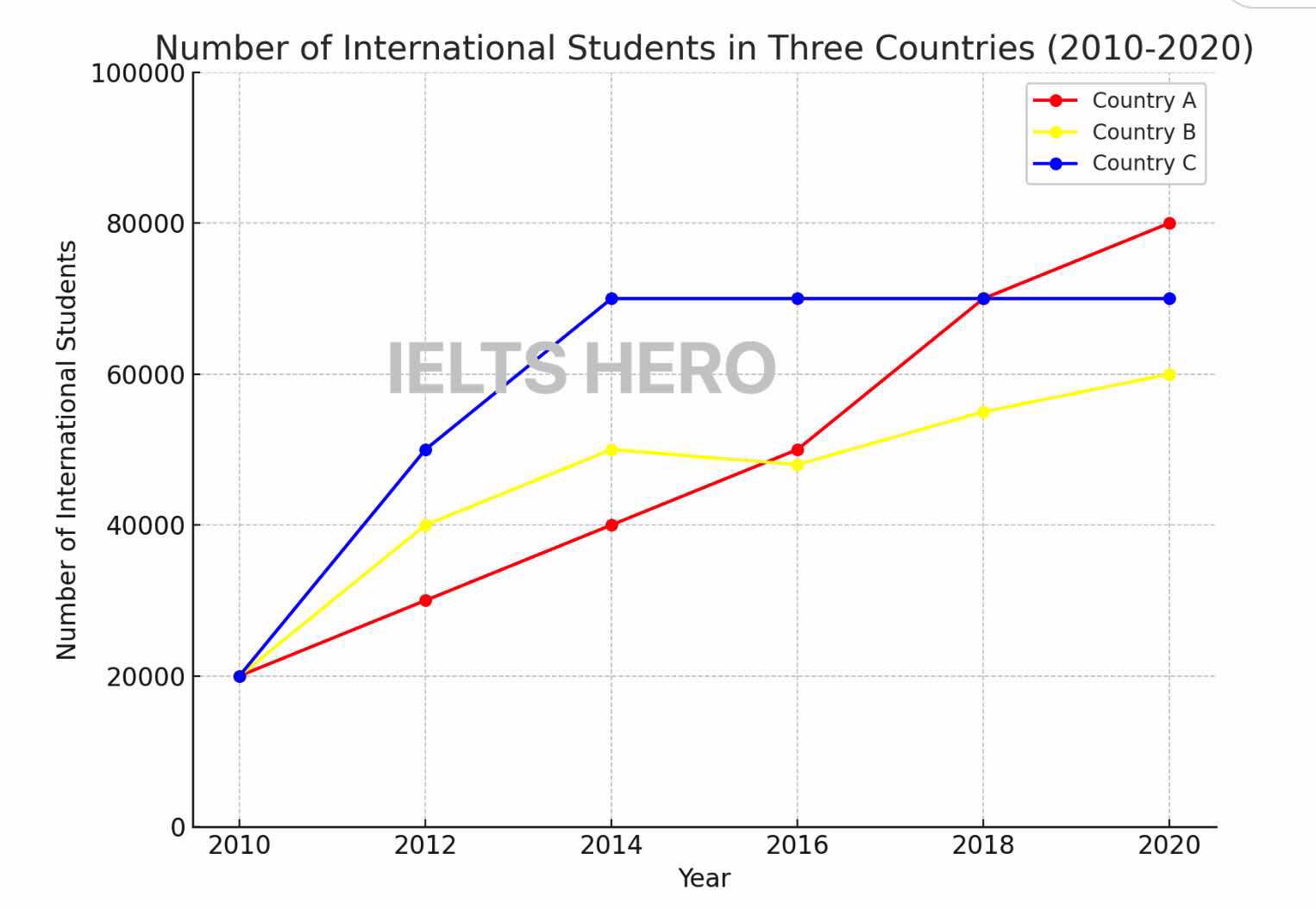
The line graph illustrates the number of international students studying in three different countries — Country A, Country B, and Country C — over a ten-year period from 2010 to 2020.
Overall, the number of international students increased in all three countries, although at different rates. Country A experienced a steady and consistent rise, while Country B's numbers fluctuated slightly throughout the period. Country C saw a rapid increase in the first few years, which then levelled off toward the end of the period.
In 2010, the number of international students in all three countries started at around the same level — approximately 20,000. However, by 2020, the number in Country A had risen steadily to reach around 80,000. Country B's figures showed fluctuations, rising to about 50,000 by 2015, dropping slightly in 2017, and then reaching 60,000 by 2020.
Country C experienced a sharp increase from 20,000 to about 70,000 between 2010 and 2015, after which the number plateaued and remained at around the same level until 2020. Despite all three beginning at the same point, Country A ultimately recorded the highest number of students by 2020, narrowly ahead of Country C.
Working Hours & Salaries Across Five Professions
TableThe table below shows the average weekly working hours and average annual salaries for five different professions in a European country in 2023. Summarise the information by selecting and reporting the main features, and make comparisons where relevant.
The table presents data on the average weekly working hours and annual salaries for five professions in a European country in 2023.
Overall, lawyers earned the highest salaries but also worked the longest hours, while chefs worked comparably long hours for significantly lower pay. Teachers worked the fewest hours per week, though their salary was mid-range among the professions listed.
In terms of earnings, lawyers received the highest annual salary at €95,000, followed by software engineers at €78,000. Teachers earned €42,000 per year, placing them in the middle of the salary range. Nurses received €36,000, while chefs earned the least at just €28,000.
Regarding working hours, lawyers also topped the list at 52 hours per week, closely followed by chefs at 50 hours. Software engineers worked 42 hours per week, and nurses worked 38 hours. Teachers had the shortest working week at 35 hours. Notably, chefs worked almost as many hours as lawyers but earned less than a third of the lawyer's salary, highlighting a striking disparity between hours worked and financial compensation across these professions.
The Water Recycling Process
Process DiagramThe diagram below illustrates the process by which wastewater is treated and recycled for reuse. Summarise the information by selecting and reporting the main features, and make comparisons where relevant.
The diagram illustrates the six-stage process through which wastewater is treated and made safe for release or reuse, along with the handling of two by-products generated during the process.
Overall, the treatment cycle moves from raw sewage collection through progressively more refined purification stages before producing clean water, with useful materials extracted at two intermediate points.
The process begins with the collection of wastewater from sewers and drains, which is then transported to a treatment facility. In the second stage, screening removes large solid objects from the water. The water then undergoes sedimentation in step three, during which smaller solid particles sink to the bottom and form sludge. This sludge is removed, dried, and converted into agricultural fertiliser — one of the two main by-products of the process.
In step four, biological treatment uses microorganisms to break down organic matter in the water. This stage produces biogas, which is captured and used to generate electricity, thus making the process partially self-sustaining. The partially treated water then passes through disinfection in step five, where chlorine or ultraviolet light eliminates remaining pathogens. Finally, in step six, the clean water is either released into the environment or recycled for reuse.
Changes to a Town Centre: 2000 vs 2024
MapThe maps below show the layout of a town centre in 2000 and in 2024. Summarise the information by selecting and reporting the main features, and make comparisons where relevant.
The two maps illustrate how the layout of Riverside town centre changed between 2000 and 2024.
Overall, the town underwent significant redevelopment over this period, with a clear shift from industrial and underused spaces toward residential, commercial, and recreational facilities.
The most striking change in the northern part of the town was the demolition of the factory in the top-left area, which was replaced by a residential housing complex. The open car park in the centre of this zone was upgraded to a multi-storey car park, presumably to accommodate the higher population density. The outdoor market in the top-right corner was also removed to make way for a large enclosed shopping centre.
In the southern part of the town, the small local shops along the High Street were retained but renovated. The High Street itself was pedestrianised by 2024, suggesting an effort to reduce traffic and improve the area for pedestrians. Most notably, the large area of empty land that had occupied the south-central and south-eastern portions of the town in 2000 was transformed into a public park, providing residents with a green recreational space.
Task 1 Timed Writing Practice
Choose a prompt below, then start the 20-minute timer. Write your response in the box — aim for 150–190 words. When time is up (or you finish early), you'll see your word count, time taken, and a self-check list to review your work.
Time's up — well done!
Here's how your practice session went. Review your response against the checklist below.
Self-check — did you…
Put your Task 1 skills to the test
Use our timed writing practice to write a Task 1 response under exam conditions — aim for 150–190 words in 20 minutes. Then challenge yourself with a Task 2 essay.